Saturday, October 31, 2009

Day 31: What I've Learned

I've made it! A whole month of quilting challenges done. Today I chose to revisit the exercise I did on the first day of the challenge - the art quilt in a box. Below is a photo of the two compositions I created side by side. The one on the left was done on Day 1 and the one on the right was done today, day 31.


The theme for the composition this morning was 'joy' and I feel like I've done a fair job of capturing it. Below is a close up. If you are looking at this online, you might want to double-click on it to see a larger, more detailed photo. That way you will be able to see all of the work I did that doesn't really show up with a smaller pixel image.


To create it, I used leftover pieces of fabrics that had fusible on the back, included some Angelica fibers with Misty Fuse, used Paintsticks to create the spirals and color in the background. I used various decorative threads and some of the built-in stitches on my machine to decorate the composition.

So, what have I learned from this challenge?

  • To relax.
  • To be less of a perfectionist.
  • That sometimes really neat stuff can happen when you least expect it.
  • That adding organza circles can be genius.
  • That Paintsticks aren't so bad after all.
  • That I absolutely love silkscreening, dyeing and discharge.

So where do I go from here?

Next month I am going to work on my machine quilting. I do not plan on blogging every day, though. And I am most definitely taking tomorrow OFF.

Happy stitiching!

Friday, October 30, 2009

Day 30: Finishing up


Today was BLS day - bind, label and sleeve, the finishing touches necessary for all quilts. Some people may argue that a hanging sleeve and label are optional, but if you plan to exhibit your quilt or to give it to someone, both are necessary. You need the sleeve so that your quilt isn't hung on the wall with thumbtacks and you need the label for documentary purposes. You won't remember when you made the quilt when you've finished two more afterwards and should this quilt be passed down in your family, your kinfolk will want to know when granny created this piece of folkart.
Some people enjoy this part of the process. I find it boring. I don't enjoy binding quilts. Yes, it does keep my fingers out of the chip bag in front of the television, but that's about all that I find interesting about it. It's alot like basting for me - required but grunt work.
There are several different options for binding a quilt. Some small art quilts don't even have a binding - instead, the edges are finished via a short seam length and a few trips around the edges of the quilt with decorative thread. The standard binding, as shown above, is a 1/4 inch double binding created from 2 inch strips, sewed together on the bias and folded in half. The raw edge is sewn to the front of the quilt and the folded edge is folded over to the back and affixed via a blind stitch. Another binding option that is popular in the Seattle area is to have no binding showing on the front of the quilt. The binding fabric matches the backing fabric, is sewing to the border fabric on the front, turned like a pillowcase and the opening on the back is whipstitched.
The easiest way to create a sleeve is to use some of the leftover fabric from the backing, cut it about an inch shorter than the width of the quilt and 9 inches in height. Fold over the edges on the two short sides and sew, then sew a seam along the long side. Turn inside out and press. When you sew your binding to the front of your quilt, include the top of your sleeve at the top of the quilt on the back. You need to whipstitch the bottom of your sleeve or the sleeve will show when the quilt is hung. If you tack down the sleeve flat, when your quilt is hung, a bump from the hanging pole will show. An easy way to avoid this is to fold up the bottom of the sleeve by about an inch, press to get a seam guide and stitch. When you flatten the sleeve back down, you won't see the seam and when the quilt is hung, the extra inch or so will make room for the hanging pole.
The label. The hardest part about labeling the quilt for me is coming up with a name for the quilt. Remember, it's not art unless it has a name and a price, so I always name my quilts in hopes that some day someone might buy it. You would think that it would be easy for someone who used to write for a living to come up with a pithy name, but all creativity drains from my body whenever I have to come up with titles. The quilt at the top of the page is named "Black, White and Red All Over." Yeah, kind of hokey and done to death, but I warned you.
On your label, be sure to include the name of the quilt, the year it was created and your full name. Some quilt shows require full contact information on labels. I create a secondary label that contains all of the information and put it over my label whenever I send a quilt to a show because I don't want my full contact information on all of my quilts.
I create my labels on my computer - it makes for a clearer and cleaner label. Many times I do a big batch of labels for as-yet-unlabeled-completed quilts and soon-to-be-finished quilts. I also have a sheet of 'blanks' with the year and my name. For those labels, I write in the name of the quilt with a black Pigma pen (I iron freezer paper to the back of the label so that the fabric doesn't shift as I write.). I then heat set the ink with a dry iron so that I don't smudge the label while I'm stitching it to the back of the quilt.
That's it. The quilt is done.
Or is it?
I'm still thinking that some red hot-fix crystals would be a neat addition.

Thursday, October 29, 2009

Day 29: Longarm quilting


My friend Barb Magill is a longarm quilter and invited me over to her quilting studio to give me a lesson on how to use a longarm quilting machine. I've tried using one of these behemoths several years ago and, frankly, it frightened me. The machine is huge and stitches very quickly.

Since that first try, I've spent several hours on my home machine quilting and feel confident in my abilities moving the fabric under the needle. When using the longarm, the fabric is rolled taut and it's the machine that you move. For something so large, it's amazing how easily it moves. I had to remind myself not to hold the handles in a death grip. With the stitch regulator, I was able, after practicing for an hour, to get comfortable enough to know that, if I needed to, I could do a fairly decent job doing larger scale stippling, looops, daisies and other curvy motifs.

I liked using the machine more than I thought I would. Still, I don't really have the space for it and for now, I'm going to stick to my Bernina (with it's stitch regulator) and work on quilts that are not king sized.

Wednesday, October 28, 2009

Day 28: Curves to soften edges

Geometric quilts can be very beautiful, but adding curves can soften the look and add interest. Today I added curves to previous compositions created this month. The quilt created in the Circle Play class does have circles in the center, but the combination of the black and white color scheme and the strong angles create a hard edged look. I decided to use a quilting scheme I've seen done on other quilts - I quilted using large curves.
Coming up with a template put me in a quandary. I tried the largest dinner plate I had, but it was too small. I tried the largest platter but it had a fluted edge. I finally found a glass topper for an occasional table (those three-legged press board tables that many use until they can afford the 'good stuff'). I used a variegated red and black thread for the quilting. It didn't pop the way I expected it to. I guess that just means I'll have to play with paint or hot fix crystals.


Quilted circle play quilt Closeup


The other piece I altered was one I created in the first week of this month - a study of color and shading. I call this one "Square Pegs in Round Holes." I used a gold organza, roughly cut into circles, and machine stitiched them over the green squares. I really like the effect.


Tuesday, October 27, 2009

Day 27: Hand beading

Today was my day to experiment with hand beading. This is something I've wanted to do for quite a while but was anxious because I didn't know where to begin and I had visions of chasing small beads around the room. My small quilting group met today and I needed some hand work, so beading it was. It helped that I hosted the meeting at my house so any errant beads would be a mess I could clean up rather than a mess at someone else's house.


I started with a piece that I created at the beginning of this month of quilt challenge - actual texture. This piece is a collage using many different types of fabrics. It's calm and pleasing albeit a bit boring. It would definitely lend itself to some embellishment.


I picked up some tubes of beads at my local Fred Meyer for cheap and began adding some interest. I decided that the round orb (sun or moon, you pick) could use a little shimmer, so I beaded one half. People tell me this composition looks like fish swimming, so I added a bit of green for the shore little beads as a school fish.

The result is alot more vibrant. Of course, I think it still can use a little more work, so this one will have to remain in my 'working' bin of the quilt studio.

Monday, October 26, 2009

Day 26: Double-sided thread painting

When I went to the La Connor Quilt Show earlier this month I saw a beautiful quilt of a crane. After oo-ing and ah-ing over the threadwork, a volunteer working at the show informed me that I was actually looking at the BACK of the quilt. I walked around to the other side and, lo and behold, I saw the front, an even more beautiful, heavily embellished piece of quilt art. The clever quilter had filled her bobbin with the same thread as the needle, creating a double-sided masterpiece.

I didn't have time today to create such a masterpiece but I did have some time to do some doodling. I stamped one piece of fabric, the front, with a fun gecko stamp painted with a moss green.
Then I waited for the paint to dry, sandwiched the same fabric on the back with batting in between, loaded my bobbin with the same thread and my needle and began to paint with thread. I used two different threads. Then I checked the back. The first bobbin I used was already filled and I discovered that it was filled with thinner thread. The fill in was pretty light. So I changed threads and filled in again. The back still needed work - the front had paint so there were areas I obviously missed. Finally, I turned the piece over and did a final pass over the geckos.
Front Back

Sunday, October 25, 2009

Day 25: Thread embellishment


Today I took the composition from yesterday and used free motion quilting in various colors of thread to embellish the piece. I added the striations for the canyon and focused on the wispy clouds in the sky.

Saturday, October 24, 2009

Day 24: Landscapes

Landscapes can provide wonderful inspiration for quilts. My family loves to camp and to travel and my husband takes some gorgeous photos of our trips. We've been to the Grand Canyon twice and some of the photos actually do justice to the breathtaking scenery. Below is a photo taken by my husband that I particularly love.
In order to turn this beautiful landscape into an abstract for a quilt, I first need to make the photo black and white. This way I can see the contrast without the colors clouding my judgement. I used Microsoft Digital Image Pro to change the photo but there are other photo and image altering programs on the market that will also do the trick.
I created a cartoon of the landscape by placing a piece of paper over the black and white photo and, using a light box, tracing the major lines. This gave me an 8 inch by 11 inch pattern. I enlarged the pattern and printed it out at 11 inches by 17 inches. Then I picked out some fabrics from my stash of hand dyeds, looking for interesting colors and hues. I transferred the pattern to freezer paper and cut out the pieces, adding a 1/4 inch seam allowance all around. The photo show the pattern pieces pinned to my design wall.
I used a technique called 'air applique' to piece together the landscape. Normally, one might stitch each piece to a foundation piece of fabric. In air applique', you piece the pieces directly together, folding over one piece 1/4 inch and overlapping the other. Barbara Olson uses the technique and I learned it from her in one of her classes. The resulting landscape is below.

This is a fair abstract representation of the original photo. Tomorrow, I will use surface embellishment to focus on the striations of the Grand Canyon and bring it to life.

Friday, October 23, 2009

Day 23: Machine Quilting - Feathers

Feathers are traditional favorite quilting motif. You can find them in antique quilts, meticulously crafted by hand and very contemporary quilts, quilted on long arm machines. I don't have a long arm machine - where would I put it?- but I do quilt using my home machine (a Bernina with stitch regulator - I love it!). What better way to explore machine quilting than to work on feathers.

I happened to have an Irish Chain quilt top that needed quilting. A feather wreath in each 'blank' block is the perfect spot.


I transferred the wreath motifs using a stencil and blue water erasable pen. After basting the quilt, I stitched in the ditch to secure the quilt and stitched diagaonally across the nine patch blocks. After that, I quilted in the wreaths. The photo below is a closeup of the stitched wreath.


After adding the wreaths, the borders were filled with a line of feathers. This piece would have lent itself well to trapunto, causing the wreath to pop. I also plan to run some diagonal lines around the wreath and in the center to highlight the wreath.

Thursday, October 22, 2009

Day 22: Reverse stained glass


Reverse stained glass is a technique I learned during a class I took from Barbara Olson. In the class, we took a photo of something that had a pleasing composition (I picked a photo of flowers in Yellowstone), outlined the main figures, creating a cartoon of the image, and enlarged the result to create a pattern. Then we made freezer paper templates for each of the segments identified in the original cartoon of the photo. When I chose my photo and outlined over the wildflowers, the result had a stained glass appearance. Barabara suggested I try reverse stained glass. Instead of piecing the templated fabrics together, I cut them a smidgen smaller and fused them to a black background. The photo above shows the result.

Today, I simplified the process to show you how this works. I found a free stained glass pattern on the internet and printed it onto inkjet fusible web. I picked scraps from my stash, cut out the different shapes and fused the fabric to the shapes.

I then placed the fabrics on the black background and fused them. The inkjet fusible web is not sticky backed. In the future, I would use a sticky-backed fusible and transfer the image via a sharpie rather than using the printer.
In order to secure the pieces, I sewed the pieces down using monofilament thread. This process is a fun and quick way to create stained glass quilt blocks. It might be fun to find several of these blocks to create a whole quilt with them in the future. It is also a method that would lend itself well to working with a group of kids, such as a class working on a quilt for a school auction.


Wednesday, October 21, 2009

Day 21: Reverse applique'

In honor of Halloween, I decided to feature a Jack-o-lantern as the focus of my reverse applique' project. In applique', you cut out a motif and apply it to a background via sewing or fusible web. In reverse applique', you layer the fabrics, sew around the intended motif and cut away the top fabric to reveal your motif. Below is a picture of my fabrics layered and my motif drawn on the 'background' fabric. I discovered yesterday in my latest Rachel McTavish book, that you can transfer patterns using a light box even on dark fabrics. What a revelation! I just assumed (a bad idea) that the light wouldn't show the image on the dark fabric, but it works like a charm. Now I don't have to transfer my images twice - once using a graphite sheet and then with my white marker.


After transferring my picture, I sewed around the edges and cut away the top layer to reveal the orange fabric.


Then I cut away the orange to reveal yellow eyes and stem and couched yarns around the eyes, nose and mouth.


One thing I might have done different that would have been interesting is to sew the veins of the pumpkin vertically on the pumpkin. Once the fabric was cut away, the veins in black would still remain.

Tuesday, October 20, 2009

Day 20: Quilting motifs 1


Have you ever created a quilt top that you worked so hard on, by the time it was time to quilt it, you were terrified that you might ruin it?

That's what I feel like when thinking about quilting a Bear Paw quilt I recently made. The top was meticulously pieced - many blocks were redone if the seams weren't perfect. The setting is original and took me weeks to work out and then weeks again before I had to guts to try and piece the darned thing. Add about a thousand flying geese around the borders and the thing makes my head hurt.

Just the same, it's not a quilt until it's quilted. So I decided to take the opportunity of this month and spend a day working on the quilting design for the quilt.

I'm not finished. It took several hours and a trip to two different quilt shops to gather what I needed then a few hours of pattern choice and transfer until my right wrist was screaming in pain.

The good part about today: I watched some of the DVD that comes with Karen McTavishes book "Quilting for Show" and went out and bought her book "The Secrets of Elemental Quilting" (which also comes with a DVD). Both are available at most quilt stores as well as her website http://www.designerquilts.com/products.html. I've already decided that my task for the month of November will be to go through her books and work on my machine quilting and create at least one wholecloth quilt.

Monday, October 19, 2009

Day 19: Slash and Sew

What do you do with a project you don't like? The way I look at it, you have three options: throw it away, try to fix it or punish it by trying different techniques on it. I'm not averse to putting bad work in the trash. Every artist makes mistakes and lots of work gets thrown away. If you can't bear to throw it away, then it can become an albatross around your neck. Albatrosses are something no one needs.
Option 2 is to try and fix it. I've done this...alot. Being a perfectionist can be a real drag, though and this month isn't about being perfect. It's about learning and having fun.
That leaves me with option 3. I think punishing it sounds like the most fun, so that's what I did. The 'victim' is my Christmas background that I discharged. I wasn't too thrilled with it when I first created it. Discharging just made it uglier to me.


I took the project and slashed it vertically and off kilter. Then I inserted green strips between each cut strip.

It already looks better. Yes, I turned it upside down. I had to. I picked a directional fabric (green with gold trees) and when I sewed in the strips, I put them in upside down. Oh well. No biggie.
But I wasn't done yet. If slashing it one way was good, how much better would additional slashing be? I cut the piece into four pieces, turned two on end and sewed them back together.
The result is a Christmas fence rail that looks a little like someone had a bit too much wassail when they pieced it.
Just the same, I kind of like it.

Sunday, October 18, 2009

Day 18: Resist printing

Any kind of barrier that stops dye or paint from moving across the threads of the fabric can be thought of as resist - i.e.: the area underneath the barrier is resistant to the dye or paint. I have used different methods of resist printing in the past. One of the most recent examples is a sunflower I printed. There is resist or batiking solution available for purchase or you can try what I did (a method described in a recent issue of Quilting Arts Magazine) - I used Elmer's blue gel washable school glue. The glue provides the resist and the color blue is used because it's easier to see than the clear gel. For my sunflower project, I took a picture of a sunflower then traced the outline via a lightbox onto another piece of paper. I enlarged the outline via my printer's posterize option, placed the white fabric on top of the enlarged copy and traced the lines with the school glue. After it dried (it takes a while if you apply the gel too heavily), I painted the flower.
The method I tried today was described in the Quilting Arts book and uses freezer paper to provide the resistance. I cut out a Hawaiian quilting design and pressed the freezer paper pattern onto my fabric. Then I used paint to cover the fabric.


The problem was that the paint was too wet, allowing the paint to wick across the fibers underneath the freezer paper. If I try this again, I will be sure not to thin my paint and to use a standard stenciling method of applying the paint. I will also cover the surface underneath the fabric with paper towels - the lack of towelling helped the paint to migrate on the plastic protective surface.


The last two pictures I want to show you were taken in Malaysia nearly 20 years ago when I visited a batik factory.


Saturday, October 17, 2009

Day 17: Discharge aka Fun with bleach

Who'dve ever thought that bleach could be fun? If you slop it on your favorite pair of jeans by accident while doing laundry, it's a tragedy, but if you mix it with water and squirt it on fabric on purpose, it can be loads of fun.

Today, I studied discharge - a method of removing dye from fabric. I used three methods for masking areas that I did not want bleached: plastic templates, paper-backed templates and my tree silk screen. I was happy to see that the paper templates stood up fairly well with less degradation than I had feared. The plastic templates worked well. I used a bleach and water solution for two projects, discharge paste and a Chlorox bleach pen.

Bleach solution in a squirt bottle

A well ventilated area is necessary, so the garage was the perfect space. I spread a layer of plastic, covered it with a layer of old towels to protect the flooring and mop up any excess bleach and water.


I had a nice black batik that I sacrificed for one piece. It already had a reddish-orange color in the print so I figured it might discharge to something beautiful. And it did. I placed pre-cut paper-backed musically-based motifs onto the fabric and squirted it with a 1:1 solution of bleach and water. The bottle I used didn't have the ability to create a fine spritz, so the fabric was very wet. The result was something akin to cave drawings. I really like it. I have some wonderful stamps of masks and petroglyphs that I may use with this material.


The next piece I chose to discharge is the Christmas-themed background I made earlier in the month. Rather than cutting out and appliqueing circles, I decided it would be fun to cut out various sized circles from plastic template material, adhere them to the fabric with non-permanent spray adhesive, then squirt with the bleach solution. As you can see from the results, the discharge was far more subtle than in the previous piece. The dark reds and greens can be seen well, but the beige areas don't show the circles very well. I guess this piece is going to have to be subject to more experimentation...


Discharge only took a minute or so, then the fabrics were rinsed in a bleach-stop solution for a few minutes and laundered.

Chlorox bleach pen

This is a great method if you want to scribble on fabric. Like the other directly applied method of bleach, this only takes a minute or so to work and the fabric must be rinsed in a bleach stop solution and laundered afterward. I forgot to shake up the pen before first applying the bleach, so I ended up with a few blobs on my project.


With the bleach pen applied After rinsing

Discharge paste
Discharge paste was applied using a brush over a screen. After you brush on the discharge paste, you allow it to dry, then you use steam from your steam iron to activate the paste. As you can see, the paste really bleaches out the area where it was applied entirely.

Friday, October 16, 2009

Day 16: Foiling and screen printing

I am now officially mid way through my quilting challenge this month! I'm trying to decide what to do for November. If you have a suggestion, drop me a line.

Several years ago I took a class from a local quilt artist, Colleen Wise, on screen printing using a thermofax machine. In that class, we learned how to create our own screens and print using paint and foil. This morning I dug out my supplies and played. I had forgotten how to use the screens and how to foil so I did some research online. After many mistakes, I finally got some nice results. I used a foil adhesive that you apply lightly and allow to dry. You can also use a fusible such as steam-a-seam-2 to apply the foil. I used screen printing screens, stamps and stencils with varying degrees of success. I liked using the screens the best.

Lessons Learned:
  1. Practice on scrap fabric to get the iron temperature correct. If it's not hot enough, the foil won't adhere. If it's too hot, the foil will melt.
  2. Old foils sometimes don't work. All of my foil is several years old and some of the pieces just didn't foil.
  3. Use a teflon pressing sheet to protect your iron. Or else you will end up applying foil to your iron like I did. BTW, a pumice stone will scrape the foil off but will scratch your iron. Which leads me to rule 4.
  4. Use an old iron that you don't mind wrecking.
  5. Apply the adhesive judiciously. If you apply too much, you get a muddy effect and it takes longer to dry. If you try to iron on the foil while the adhesive is wet, you just end up applying the adhesive to your foil instead of foiling your fabric.
  6. Be sure to use pre-washed fabric. I prewash nearly always, but I used a piece of fabric I had bought to back a quilt that had a top that wasn't prewashed (it was made from jelly roll strips which aren't washed), and since I didn't want the top to shrink and the backing to bunch up, I didn't prewash it. That made it more difficult for the foil to adhere. Any directions you get online tell you to pre-wash but, just like yesterday when I ignored the advice to mirror my image, I thought I could skip that step. Silly me.
  7. Apply the paint to the correct (smooth) side of the screen. I didn't on one print and the effect wasn't near as crisp.
  8. Screen printing is TONS of fun!

Here are the results of the playtime fun today.

Two compositions. The one on the left is on the non-prewashed. The one on the right using the correct iron temperature and hand dyed fabric. The one on the left used a tree screen and attempts using steam a seam, stamps and stencils. The one on the right is a steaming coffee cup screen using different colored foils.
One of my hand dyed dark shades of emerald green (equal parts black and emerald green) with screen printing of a tree in 4 different colors. I may turn this into a table runner...
A close up of the gold painted tree printed on the dark green. This is my favorite of all of the prints today. If you click on the photo and look closer, it almost looks as if it was machine embroidered with gold thread.


Thursday, October 15, 2009

Day 15: Fabric portraits made easy

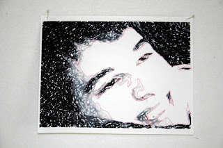
Quilting Arts has a television show that runs every Saturday on one of our local PBS stations. One of the techniques shown was an easy method of creating fabric portraits. This technique was also published in the Quilting Arts book. The steps are fairly easy and the result, at least in my case, was a cool abstract.

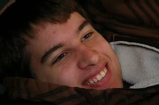
Step 1: Take or find a photo of a favorite subject. Mine is my teen aged son, Nick. Photography note: I got him to smile by telling him not to smile. I took a closeup. In the QA book, they use a larger photo and crop it down to a postcard sized photo, 4 inches by 6 inches. I chose to work in the larger 8 by 11 format.


Step 2: Upload the photo to your computer and, using your favorite photo editor (mine is Microsoft Digital Image Pro), change the photo to black and white. Digital Image Pro also has fun effects you can use to alter your photo. I've used this before to create a quilt of me during my blonde days inspired by Andy Warhol that I called Fifteen Minutes of Fame.


For Nick's portrait, I tried the film effect, which was cool but settled on the charcoal effect.
Step 3: Find 3 - 4 gradations of gray scale for the photo and trace around the areas.


Step 4: Mirror image your photo. This may seem unnecessary. I thought so and didn't do it. Big mistake. Later on, when putting the fabrics together, your image will be backwards and it will be MUCH more difficult to follow your pattern. Learn from my mistake and you'll avoid the headache.
Step 5: Find 3 - 4 fabrics (depending upon the number of gradations you chose) and adhere them to a fusible paper-backed product such as steam-a-seam 2. Here's where I got to use a neat new product. You can now buy fusible sheets that can be fed into your ink jet printer. This means that you no longer have to copy your image to the paper by hand - the computer does it for you! I love this stuff. It will be on my Christmas and birthday list from now on.
Step 6: Another mistake I made that you can learn from - Choose your darkest fabric and just use it as the background. Don't bother cutting it up. Otherwise, you have to be sure to always cut exactly so that pieces fit. In the QA book, they only use one sheet of steam-a-seam and, after copying the image onto the paper, cut out the pieces and adhere them to the different fabrics. This ensures that all of your pieces fit together, wastes less fabric and is the better way to do it. If and when I do this again (because it really is kind of cool and quick), I will follow their lead. Besides, it uses less sheets of the cool new printer-friendly fusible.
Step 7: Cut out your fabric pieces, lay them onto your base fabric, using your original as a guide. When it looks good, press it in place and voila!